
")
")
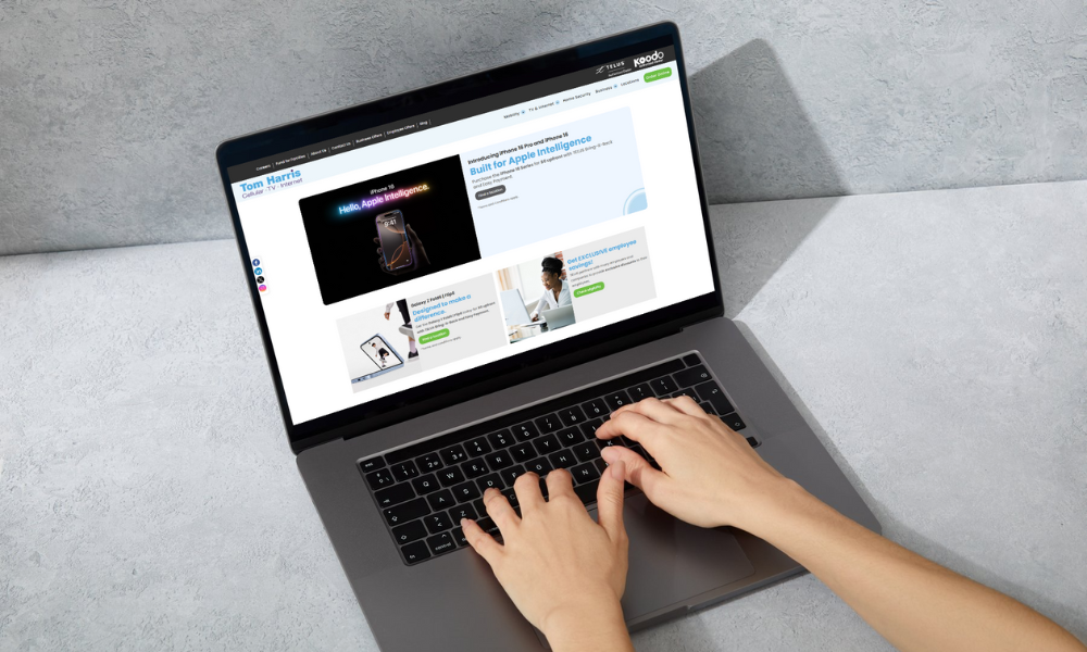
At Tom Harris, we’ve always strived to provide our customers with the best service possible. That dedication now extends to our digital presence with the complete redesign of our website. We understand the importance of a seamless online experience and have made significant improvements to ensure that every visit to Tom Harris website is as smooth and efficient as possible. In this post, we’ll walk you through the design and feature enhancements that make our new website a valuable resource for all our customers.
Sleek and Modern Design
Our new website design is visually appealing and designed with the user in mind. We’ve taken care to blend aesthetics with functionality, ensuring that every element serves a purpose while also reflecting the Tom Harris brand.
The design now features a clean, modern layout that’s easy to navigate. We have implemented a minimalist design approach, colour scheme, and typography to be both engaging and representative of our brand’s identity. This ensures that customers feel connected to Tom Harris, whether they’re visiting us for the first time or returning to browse new offerings.
Moreover, we’ve ensured that our design is fully responsive, meaning whether you’re on a desktop, tablet, or mobile device, the website adjusts seamlessly to provide an optimized view. This adaptability is critical for the growing number of users who prefer browsing on their phones.
Improved Navigation and User Experience
One of the key areas we focused on during the redesign was simplifying the navigation to make it intuitive for all users. The new navigation bar has been designed to minimize clicks and help users find TELUS products and services quickly. Whether you’re looking for the latest smartphones, high-speed internet, TELUS TV, TELUS Business Solutions, detailed service information, or contact options, everything is just a click away.
The addition of a more intuitive menu allows users to find specific products or services with ease. Plus, the incorporation of mega menus means that all related categories are clearly displayed, enabling you to navigate through large amounts of information without feeling overwhelmed. This improvement has significantly reduced the time users spend hunting for information, and we’ve already seen positive feedback about how smooth and user-friendly the navigation has become.
New Features and Functionalities
With this redesign, we didn’t just focus on looks—we added new features to enhance the overall functionality of the website. Here are some of the highlights:
- Product Filtering: Our improved product filtering options allow customers to find exactly what they’re looking for without any hassle. You can now filter by category and manufacturer ensuring a smooth shopping experience.
- Detailed Pricing with TELUS Bring it Back Options: One of the most exciting updates is that customers can now view detailed pricing for all TELUS devices, including iPhone 16 series, Google Pixel 9, Samsung Galaxy S24, tablets, and watches. We’ve also integrated the TELUS Bring it Back option, allowing customers to see the savings they’ll receive when they return their device at the end of their contract. This feature provides a clearer understanding of pricing and helps our customers make more informed decisions. Additionally, discounted offers on TELUS products are now displayed more prominently, ensuring you never miss a great deal.
- Enhanced Customer Support: We’ve made it easier to get in touch with us. With our new Contact Us option and Live Chat, customers can now receive immediate support from our dedicated team. Whether you have a question about a product or need help navigating the website, help is just a click away.
These new features make our website more interactive, providing our customers with the tools they need to have a truly customized experience.
Security
In today’s digital age security is a top priority. The new site features enhanced SSL encryption to safeguard personal information, ensuring that all interactions are secure. We’ve also implemented strong, industry-standard data protection measures to keep customer data safe, providing peace of mind for every visitor.
Future-Proofing with Scalability
We didn’t just build this website for today, we built it for the future. The new Tom Harris website is scalable, meaning it can grow alongside our company. We designed the technical framework to allow for future expansions, whether that means adding new product categories, integrating advanced e-commerce features, or incorporating cutting-edge tools for an even better user experience.
Our team will continue to monitor trends in web design and technology to ensure that TomHarris.com remains at the forefront of the digital landscape, providing the best possible experience for our customers for years to come.
Conclusion
We are incredibly excited to share the new and improved Tom Harris website with you. From a sleek, modern design to enhanced performance, accessibility, and a wide range of new features, this redesign reflects our commitment to providing the best possible service to our customers.
We invite you to explore the new website and experience the difference for yourself. Whether you’re looking for our latest products or need assistance with a service, we’re confident that you’ll find the new website easy to navigate and full of helpful tools. If you have any feedback or suggestions, we’d love to hear from you—your input helps us continue to improve.
Visit Tom Harris website and enjoy the enhanced browsing experience!